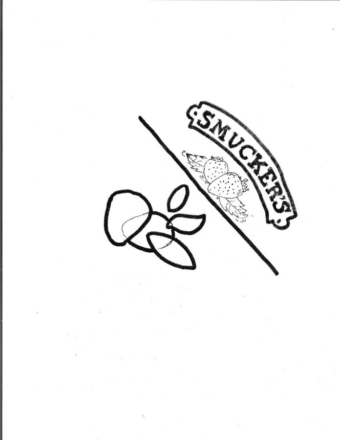
In the days of packing lunches to take to school, I used to have a lot of sandwiches. Particularly, peanut butter and jelly sandwiches often adorned with Smucker’s jam. Every morning in elementary school I would come downstairs to my kitchen and watch my dad unscrew the red plaid lid and spread the strawberry jam on the bread, then cut the crusts off. The curved lettering of “SMUCKER’S” on the jar was playful and comforting. Recently I saw something devastating, however. That J.M. Smucker’s logo has gone away from the jam roots and been replaced with a geometric, modern, design. This rebrand is unnecessary, and an overall negative change for the company.

The J.M. Smucker Company is not the only company to have rebranded recently. In an attempt to stay relevant, many brands have been modernizing lately. Google caught a lot of flack for their new icons in Oct. of 2020. The change drew controversy as the designs didn’t seem user-friendly. I had trouble distinguishing the Google Drive button from the Google Calendar button in the waffle as they have the same colors, just in a different shape. While the design was supposed to unify all the aspects of the Google workspace, it just confused people.
According to Food Business News, one of the meanings behind the change at the J. M. Smucker Company was to label itself as a Fortune 500 company and attract top talent. The director of creative services said that each shape represents something, the red representing heritage, the green shape an innovative mindsight – but I really do not care.
On the J. M. Smucker website, they go into a fair amount of detail about how they are shifting their focus to bettering the world, which of course is important. They have apparently partnered with organizations such as the Red Cross and Habitat Humanity. If the company is really striving towards positive change then their actions should reflect that, not a strange logo with blobs that apparently have a lot of meaning. So the logo, firstly, is a strange design, and secondly, seems inauthentic.
British Petroleum (BP) changed their logo in 2000 when they went from a green and yellow shield to a green and yellow flower, which is an extreme example of inauthenticity from a company. Along with the change they adopted the slogan “beyond petroleum” in an effort to seem more environmentally conscious. After Deep Water Horizon, the famous oil spill from 2010, the BP logo was morphed by many environmental activists to show the flower drowning in oil or placing it on the mouth of a gas mask. A company cannot and should not promote something that their very existence contradicts.

Logos that have racist imagery should of course be changed. The most mainstream example of this being Aunt Jemima, but others include Land O Lakes butter which recently removed the image of a stereotype Indigenous woman and countless sports mascots.
I am not sure how much the J. M. Smucker Company spent on their rebranding, but BP spent 211 million dollars according to Business Insider. That money could have been put to much better use in the hands of an organization that actually is working on renewable energy, as opposed to BP.
Without thinking about any deeper meanings behind logo changes or fortune 500 companies, when I look at the J.M. Smucker logo I wonder, are they leaves? Are they fruit? Why is it so two-dimensional? Did they have a child cut out shapes to make this logo? J. M. Smucker’s may have many brands including Jif, Folgers, and Milk-Bone, but to me, they will always be jam. To me, they will always be an overly sweet strawberry jam with a red plaid lid. So while it’s not really worth it to bring back the cute strawberry logo now, I will never see Smucker’s the same way. The strawberries will always be better.


